Disagree. The character art of the WC2 Troll compared to the WC3 Troll looks like an excellent adaptation from one to the other.
Also, that's a poor choice of image for SC2. Early SC2 shots faced the same criticism as the Diablo ones have (since the WarCraft stylization is now pervasive in everything Blizzard does, ugh), but they have since been considerably improved (though I think they could still be grittier, especially the Terran)
Since you are taking me out of context: for all the issues the D2 inventory system has ("Tetris"), it's still better than the single-box, every item takes up the same space system that we're currently seeing.
Perfect!
I hoped for an organized thread hosted by someone like you medievaldragon, things where getting nasty and everyone where shouting personal attacks instead of discussing due to uncapability to discuss. From both sides, I'm not trying to blame anyone here...
I realise this post is long as hell, but I couldn't make it shorter
on the actual topic:
I have quite alot of things that I'd like to vent about how diablo is now, I'd like to not only point out what could be better, but also why and also perhaps what could be done to make it better. I want to state that I've seen the interview in gamespot, all the panel's and all footage we have so far, some things even more then once.
1) The colours.
I'm very unhappy with the green/blue shine in the tristram cathedral. While I have listened to what the art designers have said about color - and agreed - I don't find it nessisary to add colour that just doesn't fit in, such as green and blue light. It's almost as a "theme", where does it come from?! I have no idea - to me it just seems to be something I'd love to see in the warcraft universe, where everything is "Whoopidooopy" and "woshhiiwooshi" - it just doesn't fit.
I don't want everything to be black/white - colours are very important and it would not be "realistic" without them as some try to argue for, it would rather be "unrealistic", but don't throw in dumb colors that shouldn't even be there for the "stylized" look, it looks horrible I must say.
also about the colours, I realise everything can't be dark-dark-dark, the desert is light, the sunshine is very alive and ofcourse I understand thit. but just because its light doesn't mean it should be happy. It's the sanctuary, get rid of those corny happy statues and flowers please, they look almost polished as if they where risen yesterday... come on this is old buildings and statues that should be "used"!
I'd like to throw in a quote to response to a nice point from the gamespot interview
2) the art-theme/style _PARTIALLY_
Some things are very good - I like the buildings of the first cathedral.
but some things are also very bad.
- number one - what is up with the oversized armory/gear. no! nonono! that's nothing to do with diablo. diablo aint "Shoop da woop mega-fantasy power all the way", its somehow realistic, the armor are big in diablo II - no doubt, but nothing like world of warcraft, its CARTOON's.
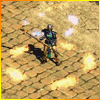
Here's a very good picture of what I mean
#1 http://i31.tinypic.com/2qdohhh.jpg
- number two - the shape and style of the environment, some parts are good but some
parts are messed up.
these are the two examples I have that show what I mean in general:
#1 http://s93065215.onlinehome.us/misc/00-17-53.jpg
"Stylized" does not mean "cartoonish" - I agree, but sorry that is cartoonish...
#2 here's some more http://i28.tinypic.com/2mfbwu9.jpg
- number three - the style of the boss' in the game, I mean oversized belly isn't evil, its fantasy and cartoony - it makes me go "haha fat guy with funny weapons" more then "oh god he looks dangerous", take butcher from diablo1, he's scary.
the boss in the cathedral, who's even supposed to be summoned straight from hell, is NOT.
3) Light Radius
Just bring it back, when its needed - in desert it doesn't apply obviously, but down the monastary obviously its dark as freakin' hell and light radius would add such a more horrific touch to the game.
plain and simple - give us light radius
4) Graphical effects - glowing "stuf" from spellcast AND SO ON.
- first example http://www.blizzard.com/diablo3/_images/screenshots/ss26-hires.jpg
This make you go "hehe, insane power from a happy little fella'" not like "wow he's a man of insane memories and desperation who uses pure wrath for his power"
which it should be. hard to explain, it seems mystic-happy not mystic-desperate/dark
- Second example http://www.blizzard.com/diablo3/_images/screenshots/ss15-hires.jpg
Wtf? why is that glowing alien green? if its poisonouss or something I doubt the poison would shine like its some aliensubstance with freons in it, would it?
not in diablo atleast, perhaps in some other game.. try.. warcraft.
EDIT: 5) - it just seems so polished, too smooth and like someone cleaned everything up from dirt and stuf that you picture would be in a diablo game.
Someone mentioned "bump mapping" and it sounded pretty promising!
That's all I can think of by now. - if you're already bored as fuck you don't have to read next part
here's a little "discussion" of why I don't like this stuf in general.
One can argue and say, "I like cartoony style and I like fantasy-alien-green", well, cool. It may actually even be more popular then the true diablo-style. but HEY, this is diablo III and I want it to be kept diablo III not some "popular"-version diablo that is made to fit the "broad audience"... if the audience want this cartoon-style there's plenty of other games they can go play.
One can also say "whats wrong with warcraft?" Nothing - its just that its so far from diablo, its not the same universe and it should not be there, while one can argue saying that it doesn't matter so much, it doesn't help it just makes the game more so-so.
I know the game isn't released and what we've seen is just the beginning, you could say that the part of the game is in the early stage of the story-line which means that we aint close enough to the evil to see the real evil, and dark stuf. But come on thats the tristram cathedral... even if its in the beginning of the game IT SHOULD BE AWFULLY SCARY! think diablo1.
And even if it was 20 years ago evil walked sanctuary, doesn't mean its now a happy place, sanctuary is a world troubled with evil and bestiary by nature.
And its easy for people to say "You've only see 1% of the game you can't judge"
well - to convince us that the game will be darker in those 99% show us some deep, evil, dark places.. as for now we are worried that there won't be any. we cant just assume it will be better @ what we are yet to see!
And I don't know if I mentioned it but yeah I realise everything aint dark in diablo II and thats good, but it wasn't filled with happy rainbows either, thats bad. it can be light but still "evil", thats correct, but as it is now I just don't see the art/graphic teams pulling that off
and last but not least - it may seem harsh to give this much hard critiscism while we should thank the gods that blizzard even considered to make a diablo III, but it happened and now we can just work to get the game to be as good as possible. I'm so very thankful for the game announcement, belive me I waited for soon a decade. But that doesn't mean I can have critiscism to hand out!
thank you.
I just wanted to bring up this post because I thought it was excellent.
Quote from "Grimhound" »
Pasted over from the now-deleted thread.
Defending the Diablo 3 Art Design
A lot of people have been going around complaining about the Diablo 3 art style far past the lighting conditions, saying that it's too much like WoW and that Diablo 3 shouldn't be in any way like that 'insult rambling insult against WoW that makes no sense here'. Now, this will probably be the one post I made on this subject where I don't openly insult the people trying to play these opinions, but rather attempt to make them see exactly how... ludicrous their position is in regard to the game itself.
You see, Diablo 3 is being made by Blizzard Entertainment, a company which has a proven history of excellence in their products. Now, when you have a single gaming studio that makes games, there's a high chance you're going to see a degree of overlap in the art styles employed, as more than likely they are being designed by the same people. So how does this affect Diablo 3? Well, the point to it affecting Diablo 3 is that Blizzard Entertainment also made another massively popular game, called World of WarCraft. This game brought in a lot of people and has given Blizzard the resources through its continued sale and success to really put the effort they want to into their own games. The art of Diablo 3 is being influenced thusly, as Blizzard has a sort of art style going into things now that is generally reflecting what came before.
Now, there's also the matter where people may contest as to why Blizzard cannot make Diablo 3 in the same style as Diablo 1 and 2. The quickest and most apt answer is that it might be because Diablo 1 and 2 were not made by Blizzard. They were made at the now-defunct Blizzard North studio, most of whom broke away from Blizzard entirely when the studio was assimilated back into the main HQ and went on to form Flagship Studios, the company that made the floppish title, Hellgate: London. So this means that not only do you have a different set of people working on the game, but the people that originally made the first two games(and even the division from which they hail) no longer exist.So, I've come to the point where I will use previously posted evidence to support my point as to how and why the art style currently is.
First comes a comparison between Diablo 3 and World of WarCraft. People have been saying that Diablo 3 is exactly like World of WarCraft, and that the graphics are both equally cartoony. My evidence to counter this statement is some of the same evidence ironically used to back up the argument. Between the two images, that of a female Barbarian and a male Orc Warrior from World of WarCraft, you will notice the difference in the saturation of color and the effect of 'grain' upon each model. While the Orc is given a vivid vibrancy, the Barbarian is rather dulled down, brought more to a reasonably level rather than holding the same sort of 'technicolor explosion' vibe. Furthermore the Barbarian is more detailed than the Orc, both physically and in the design of the armor and weapons, which shows they were going for a more mature policy of design using what resources they had.
Now, there's also the point where people may wish to use these two images to say that Blizzard is blatantly copying armor designs. I will now counter this accusation. Spikes on armor is not a new concept, and big shoulderpads are not either. On the contrary, the concept of bulky armor has for a great deal of time been known as a method to increase the intimidation factor that a figure portrays. It artificially elevates the appearance of their posture in a way commonly used in nature by certain species of animal to bluff their way out of a confrontation. So the idea is hardly even something originally thought up by Blizzard. As to the similarity to the armor designs, it /does/ make sense that they would bring over their old concepts and rework them for the new game. Yet take note that the Barbarian's armor is far more detailed, and far better designed than that of the World of WarCraft Orc. Where one seems to be novelty armor, the other looks as though it is a realistic piece of combat gear from the more mature and more dark-inclined genre of which Diablo is a part of.
Now, to address the environments, I'd like to make a few things clear. If you design everything to be dark, you'll have trouble pressing in that something in particular is /especially/ dark. If you make everything gloomy, gory, or depressing, you'll have trouble pressing in the idea that something in particular of /especially/ gloomy, gory, or depressing. That said, the artistic design seen in the Diablo 3 trailers is most definitely not the position taken for the entire game. It was most likely simply a demo environment put together to give a general idea of how the game would work. In other areas of the game we haven't even begun to see, I'm sure there is a wider variety of darker, as well as lighter areas. Diablo 3 is a game that wishes to pull us through the highest peaks of the Heavens and into the darkest bowls of the flaming Hells. Before you demand the game be brought down, take that into consideration. Also take into consideration that horror and atrocity become meaningless within an environment horrible and atrocious.
You're offering reasons for why things are the way they are, not reasons why they should be. Just because Blizzard North is no more and a lot of the people who made WoW are now working on Diablo III is not an excuse for WoW-ifying Diablo.
While you are right that the Barbarian is more detailed than the Orc, she is nonetheless far more similar to the Orc than she is to the style of Diablo I/II.
Frankly, despite Blizzard's posturing to the contrary, I think they have shown that "stylization" is the same as cartoony - or at the least, just as bad.
Drop your WarCraft styling. It's not appropriate and it ruins the game.
Realistic arms and armor. Reasonably sized and proportioned characters. Demons and villains that are terrifying, not amorphous, over-sized, and under-detailed. Ditch the blue/green glow on everything, and give us more reds, oranges, golds, browns, and grays - fire, stone, blood, decay. Not mystical fairy elf land.
I don't know that it has to be gray, but it definitely needs to be darker and more gritty. It currently looks like a gory WoW, IMO. It's a bit darker, especially the animations and the like (Siegebeast killing Barbarian), but it still looks more like WoW than it does Diablo.
I really like the idea of switching out the pervasive blues and greens with reds and golds. That, I think, it a much better color scheme.
I don't think it needs to be gray. But I definitely don't think the blue/green works well at all, and it looks a lot like WarCraft - and that's automatically a bad thing, IMO.
I lost dozens of friends to that attack. As in, three funerals a day for weeks on end, and missing funerals because of scheduling conflicts. Do not doubt that they were very, very real. I cannot describe the immensity of the pain you have just caused me by just writing that. You can keep your goddamn conspiracy theories to yourself next time, asshole.
The next time a cloud of ash from the corpses of your friends floats over your house, you can comment. Until then, keep your goddamn mouth shut.
0
Also, that's a poor choice of image for SC2. Early SC2 shots faced the same criticism as the Diablo ones have (since the WarCraft stylization is now pervasive in everything Blizzard does, ugh), but they have since been considerably improved (though I think they could still be grittier, especially the Terran)
0
0
0
But I definitely don't like everything being the same. That's boring.
0
You're offering reasons for why things are the way they are, not reasons why they should be. Just because Blizzard North is no more and a lot of the people who made WoW are now working on Diablo III is not an excuse for WoW-ifying Diablo.
While you are right that the Barbarian is more detailed than the Orc, she is nonetheless far more similar to the Orc than she is to the style of Diablo I/II.
Frankly, despite Blizzard's posturing to the contrary, I think they have shown that "stylization" is the same as cartoony - or at the least, just as bad.
Drop your WarCraft styling. It's not appropriate and it ruins the game.
Realistic arms and armor. Reasonably sized and proportioned characters. Demons and villains that are terrifying, not amorphous, over-sized, and under-detailed. Ditch the blue/green glow on everything, and give us more reds, oranges, golds, browns, and grays - fire, stone, blood, decay. Not mystical fairy elf land.
Return the Light Radius.
0
I really like the idea of switching out the pervasive blues and greens with reds and golds. That, I think, it a much better color scheme.
I don't think it needs to be gray. But I definitely don't think the blue/green works well at all, and it looks a lot like WarCraft - and that's automatically a bad thing, IMO.
0
I lost dozens of friends to that attack. As in, three funerals a day for weeks on end, and missing funerals because of scheduling conflicts. Do not doubt that they were very, very real. I cannot describe the immensity of the pain you have just caused me by just writing that. You can keep your goddamn conspiracy theories to yourself next time, asshole.
The next time a cloud of ash from the corpses of your friends floats over your house, you can comment. Until then, keep your goddamn mouth shut.