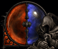
 Demon Hunter's Hatred and Discipline globe. Many people have criticized its colors as being too close to the red and blue of Life and Mana, while other people have come to its defense and noted that red and blue are simply easily distinguishable colors.
 In a thread started by our own Sixen, Zarhym made a lengthy response describing the reasoning behind the color choices for Hatred and Discipline.
 Official Blizzard Quote:

White and black, for example, would be bad. One purpose of the color scheme is to ensure it's very readable when your focus is on the game world and not the UI. Given the dark vibe of Sanctuary and the way the UI fits in with that feel, black simply wouldn't pop out at all. It'd be much more difficult to track your Hatred (which is the resource you'll be managing most frequently) peripherally when background colors are so frequently on the darker end of the color spectrum. Just the same, the suggestion of white for Discipline seems only to stand in contrast to black which, again, just wouldn't work.
Hatred was given a deep red color to give it plenty of distinction from barbarian Fury, plus red is just an angry color (refer to my avatar and personality). We also mixed in a bit of black with the red to further push Hatred toward the demon hunter's color kit.
Now, given that both resources are displayed in a single globe, it's really important to us that the colors effectively oppose one another. Unlike the color red thematically fitting Hatred, Discipline isn't a concept that has such a universal color representation. As such, the most important thing becomes readability. And the best way to make sure Discipline stands apart from Hatred is to make it color opposite, which is blue. White could have been used, but it would overpower the red-colored Hatred due its value strength (we want the values to be close together) and white doesn’t support the notion of these concepts being opposed to one another. And once again we mixed in some black with the blue to fit with the demon hunter color kit.
Zarhym's response also caused people to point out that red and green, not blue, are complimentary colors. Zarhym was quick to point out that there were other problems with using green.
Official Blizzard Quote:
It's not that we overlooked green, we just definitely didn't want to go with that. It's way too tied to poison in Diablo. It wouldn't feel right.
 Witch Doctor, which was a popular suggestion. Some mock-ups were even made in this forums thread, and although they look cool, it also looks very similar to your health globe when you are poisoned in Diablo II.
 Not only would a green resource globe look a bit too close to a poisoned health globe, but red and blue are actually farther apart on the color spectrum than red and green. By pointing out a post on theSkaBoss, Zarhym pointed us all to a small lesson on the color spectrum, which actually matters more than placement on the color wheel when distinguishing colors.
Blue and red, however... step away from your color wheels and look at a map of the spectrum. You seeing what I'm seeing? The thing about blue and red is that as far as the visible spectrum goes, they sit on opposite edges of the map. (Don't talk to me about violet, violet doesn't get to participate in this conversation.) Blue and red take on a lot of roles as opposites when you start talking to astronomers, astrophysicists, and all those smart people. The simplest example: redshift and blueshift. Basically, if something producing light is moving away from you, it looks more red, and if something producing light is moving toward you, it looks more blue. This happens because of the wavelength of the light emitted is "shortened" or "lengthened" (not really, but that's what it looks like from your frame of reference,) by the object moving toward or away from you, respectively.
Look, the point is that the colors fit together in that ONE orb for the same reason that the colors fit together in two different orbs in the last two games. The colors are just good design opposites.

So, after those lengthy and sometimes sarcastic explanations, what do you think about the Demon Hunter's resource globe? Has your opinion changed or does it remain the same? Feel free to discuss your views in the topic below.
-
View User Profile
-
Send Message
Posted Sep 11, 2011-
View User Profile
-
Send Message
Posted Sep 11, 2011-
View User Profile
-
Send Message
Posted Sep 11, 2011-
View User Profile
-
Send Message
Posted Sep 11, 2011I don't know what your deal is but please refrain from making me look like the bad guy here (not in good taste Sir). I think we all know who the real bad people are here. I haven't seen you contribute anything here either other than your simple, "change the color a little" comments. I suggest you change your tone.
-
View User Profile
-
Send Message
Posted Sep 11, 2011Exactly what i was thinking.. But still, it is a minor issue that i can live with =)
-
View User Profile
-
Send Message
Posted Sep 11, 2011-
View User Profile
-
Send Message
Posted Sep 11, 2011-
View User Profile
-
Send Message
Posted Sep 11, 2011I don't know who you are. I don't need to reply to you or anyone else for that matter because Blizzard has already stated their stance on the matter. Sixen and others were in the wrong and there is no point to discuss it further. I don't really see you contributing to anything. I just see you in angry mode typing away. Good day Sir.
-
View User Profile
-
Send Message
Posted Sep 11, 2011-
View User Profile
-
Send Message
Posted Sep 11, 2011-
View User Profile
-
Send Message
Posted Sep 11, 2011-
View User Profile
-
Send Message
Posted Sep 11, 2011-
View User Profile
-
Send Message
Posted Sep 11, 2011-
View User Profile
-
Send Message
Posted Sep 12, 2011Nobody visits diablofans to see
flamingarguments between users, they do so to discuss things in a civil manner.-
View User Profile
-
Send Message
Posted Sep 12, 2011-
View User Profile
-
Send Message
Posted Sep 12, 2011If they actually changed the mechanic, sure, change the name and color. But obviously the reason they've kept the mana mechanic is because it fits the WD's playstyle really well, and if thats the case I have absolutely no problem with staying with 'tired old' mana.
-
View User Profile
-
Send Message
Posted Sep 12, 2011-
View User Profile
-
Send Message
Posted Sep 12, 2011-
View User Profile
-
Send Message
Posted Sep 12, 2011-
View User Profile
-
Send Message
Posted Sep 13, 2011