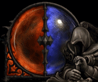
 Demon Hunter's Hatred and Discipline globe. Many people have criticized its colors as being too close to the red and blue of Life and Mana, while other people have come to its defense and noted that red and blue are simply easily distinguishable colors.
 In a thread started by our own Sixen, Zarhym made a lengthy response describing the reasoning behind the color choices for Hatred and Discipline.
 Official Blizzard Quote:

White and black, for example, would be bad. One purpose of the color scheme is to ensure it's very readable when your focus is on the game world and not the UI. Given the dark vibe of Sanctuary and the way the UI fits in with that feel, black simply wouldn't pop out at all. It'd be much more difficult to track your Hatred (which is the resource you'll be managing most frequently) peripherally when background colors are so frequently on the darker end of the color spectrum. Just the same, the suggestion of white for Discipline seems only to stand in contrast to black which, again, just wouldn't work.
Hatred was given a deep red color to give it plenty of distinction from barbarian Fury, plus red is just an angry color (refer to my avatar and personality). We also mixed in a bit of black with the red to further push Hatred toward the demon hunter's color kit.
Now, given that both resources are displayed in a single globe, it's really important to us that the colors effectively oppose one another. Unlike the color red thematically fitting Hatred, Discipline isn't a concept that has such a universal color representation. As such, the most important thing becomes readability. And the best way to make sure Discipline stands apart from Hatred is to make it color opposite, which is blue. White could have been used, but it would overpower the red-colored Hatred due its value strength (we want the values to be close together) and white doesn’t support the notion of these concepts being opposed to one another. And once again we mixed in some black with the blue to fit with the demon hunter color kit.
Zarhym's response also caused people to point out that red and green, not blue, are complimentary colors. Zarhym was quick to point out that there were other problems with using green.
Official Blizzard Quote:
It's not that we overlooked green, we just definitely didn't want to go with that. It's way too tied to poison in Diablo. It wouldn't feel right.
 Witch Doctor, which was a popular suggestion. Some mock-ups were even made in this forums thread, and although they look cool, it also looks very similar to your health globe when you are poisoned in Diablo II.
 Not only would a green resource globe look a bit too close to a poisoned health globe, but red and blue are actually farther apart on the color spectrum than red and green. By pointing out a post on theSkaBoss, Zarhym pointed us all to a small lesson on the color spectrum, which actually matters more than placement on the color wheel when distinguishing colors.
Blue and red, however... step away from your color wheels and look at a map of the spectrum. You seeing what I'm seeing? The thing about blue and red is that as far as the visible spectrum goes, they sit on opposite edges of the map. (Don't talk to me about violet, violet doesn't get to participate in this conversation.) Blue and red take on a lot of roles as opposites when you start talking to astronomers, astrophysicists, and all those smart people. The simplest example: redshift and blueshift. Basically, if something producing light is moving away from you, it looks more red, and if something producing light is moving toward you, it looks more blue. This happens because of the wavelength of the light emitted is "shortened" or "lengthened" (not really, but that's what it looks like from your frame of reference,) by the object moving toward or away from you, respectively.
Look, the point is that the colors fit together in that ONE orb for the same reason that the colors fit together in two different orbs in the last two games. The colors are just good design opposites.

So, after those lengthy and sometimes sarcastic explanations, what do you think about the Demon Hunter's resource globe? Has your opinion changed or does it remain the same? Feel free to discuss your views in the topic below.
-
View User Profile
-
Send Message
Posted Sep 10, 2011-
View User Profile
-
Send Message
Posted Sep 10, 2011Yellow= Insect
Red= Humanoid
Blue= Amphibian
Green= Undead (like ghouls and zombies, no sketleton)
Black= Liquid Creatures. (like swamp monsters)
Gray= BOSSES
WHITE= Angels. We must kill some Angels. (dark or light ones.)
!!!
-
View User Profile
-
Send Message
Posted Sep 10, 2011-
View User Profile
-
Send Message
Posted Sep 10, 2011I'm glad this issue was brought up, as I feel the same way that Sixen does about the Demon Hunter's resource color. I feel that the red/blue that the D3 artists chose is too generic and too close to the standard red/blue that signifies health and mana.
So instead of merely stating the colors that I think would be ideal like everyone else, I took the time and edited the Demon Hunter's resource globe in Photoshop to colors that I think would be more suitable. The two colors I chose aren't too far off from the ones that Blizzard chose, but I feel that they signify the Demon Hunter's character better.
My version:
Original:
Here is my reasoning behind the color choices:
1) For Hatred, I feel Blizzard chose the right color theme of red. But as I mentioned before, the red that they decided to use is just too "generic". I feel that the red has to have more relevance to the Demon Hunter, so I darkened up the default red to a sanguine red (the color of blood). Why? Because the Demon Hunter's hatred is directly linked to the lust he/she has for demon blood.
2) For Discipline, I also feel that Blizzard went with the right choice of a blue theme. But, I think the blue is too generic (the color of mana), like many other people have mentioned. I also saw that a lot of people mentioned green as a possible choice, but like Zarhym stated, green is too much reminiscent of green to be viable. So how did I resolve the issue? Turquoise! Halfway between green and blue.
3) Lastly, I feel the "burgundy-ish" red and the turquoise that I used contrast as well as the standard red/blue that Blizzard used.
Comments appreciated!
-
View User Profile
-
Send Message
Posted Sep 10, 2011I'm glad this issue was brought up, as I feel the same way that Sixen does about the Demon Hunter's resource color. I feel that the red/blue that the D3 artists chose is too generic and too close to the standard red/blue that signifies health and mana.
So instead of merely stating the colors that I think would be ideal like everyone else, I took the time and edited 68 individual frames of the Demon Hunter's resource globe in Photoshop to colors that I think would be more suitable. The two colors I chose aren't too far off from the ones that Blizzard chose, but I feel that they signify the Demon Hunter's character better.
My version:
Original:
Here is my reasoning behind the color choices:
1) For Hatred, I feel Blizzard chose the right color theme of red. But as I mentioned before, the red that they decided to use is just too "generic". I feel that the red has to have more relevance to the Demon Hunter, so I darkened up the default red to a sanguine red (the color of blood). Why? Because the Demon Hunter's hatred is directly linked to the lust he/she has for demon blood.
2) For Discipline, I also feel that Blizzard went with the right choice of a blue theme. But, I think the blue is too generic (the color of mana), like many other people have mentioned. I also saw that a lot of people mentioned green as a possible choice, but like Zarhym stated, green is too much reminiscent of green to be viable. So how did I resolve the issue? Turquoise! Halfway between green and blue.
3) Lastly, I feel the "burgundy-ish" red and the turquoise that I used contrast as well as the standard red/blue that Blizzard used.
Comments appreciated!
***Also, since I don't have a SC2 or WoW CD-key to post on the official forums, if anyone agrees with my color choices and wants to repost this on the official Diablo 3 forums, please do so!
-
View User Profile
-
Send Message
Posted Sep 10, 2011I'm glad this issue was brought up, as I feel the same way that Sixen does about the Demon Hunter's resource color. I feel that the red/blue that the D3 artists chose is too generic and too close to the standard red/blue that signifies health and mana.
So instead of merely stating the colors that I think would be ideal like everyone else, I took the time and edited 68 individual frames of the Demon Hunter's resource globe in Photoshop to colors that I think would be more suitable. The two colors I chose aren't too far off from the ones that Blizzard chose, but I feel that they signify the Demon Hunter's character better.
My version:
Original:
Standard life/mana colors (just for comparison purposes):
Here is my reasoning behind the color choices:
1) For Hatred, I feel Blizzard chose the right color theme of red. But as I mentioned before, the red that they decided to use is just too "generic". I feel that the red has to have more relevance to the Demon Hunter, so I darkened up the default red to a sanguine red (the color of blood). Why? Because the Demon Hunter's hatred is directly linked to the lust he/she has for demon blood.
2) For Discipline, I also feel that Blizzard went with the right choice of a blue theme. But, I think the blue is too generic (the color of mana), like many other people have mentioned. I also saw that a lot of people mentioned green as a possible choice, but like Zarhym stated, green is too much reminiscent of green to be viable. So how did I resolve the issue? Turquoise! Halfway between green and blue.
3) Lastly, I feel the "burgundy-ish" red and the turquoise that I used contrast as well as the standard red/blue that Blizzard used.
Comments appreciated!
***Also, since I don't have a SC2 or WoW CD-key to post on the official forums, if anyone agrees with my color choices and wants to repost this on the official Diablo 3 forums, please do so!
-
View User Profile
-
Send Message
Posted Sep 10, 2011-
View User Profile
-
Send Message
Posted Sep 10, 2011*Raging fanboy alert*
Someone piss in your cereal today? What 'scientific' reasoning did Zarhym ever provide? Nowhere did I see Zarhym address colors such as turquoise or a sanguine red.
-
View User Profile
-
Send Message
Posted Sep 10, 2011Back to OP, I too am fine with the original colors or even what traderjoes suggested. What I thought they might address was the black bar in the middle. They should somehow change it because it does take away the 3-D effect of the globe a bit. I hope Blizzard changes it.
-
View User Profile
-
Send Message
Posted Sep 10, 2011-
View User Profile
-
Send Message
Posted Sep 10, 2011THE COLOR IS GREAT!
...
I WANNA PLAY!!!
-
View User Profile
-
Send Message
Posted Sep 10, 2011-
View User Profile
-
Send Message
Posted Sep 10, 2011-
View User Profile
-
Send Message
Posted Sep 10, 2011I like this mockup. a lot.
-
View User Profile
-
Send Message
Posted Sep 10, 2011-
View User Profile
-
Send Message
Posted Sep 10, 2011-
View User Profile
-
Send Message
Posted Sep 10, 2011-
View User Profile
-
Send Message
Posted Sep 10, 2011-
View User Profile
-
Send Message
Posted Sep 10, 2011Sixen updated his original post at the bottom with mockups of black/white (including a few others):
http://us.battle.net/d3/en/forum/topic/3082213677